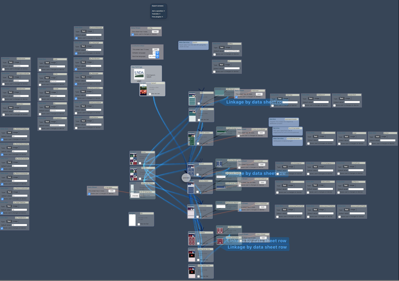
There are two purposes for this redesign: to achieve cleaner view and to also show the screen-data linkage in current separated project and data tab views. (In RS, project map does not display data blocks)
The main function of the project map is to provide an overview of all the blocks in this project and how they are related to each other. Previously, the linkage between different blocks is visualised by lines. However, the lines might interfere each other when there are just so many blocks in the map. It becomes very difficult to trace the lines.
Solution
The complexity in this can be tackled by introducing two principles in the visualisation: granularity and diverse.
The complexity in this can be simplified by a more structured presentation and utilise visualisations other than lines to show the relationship among the blocks.
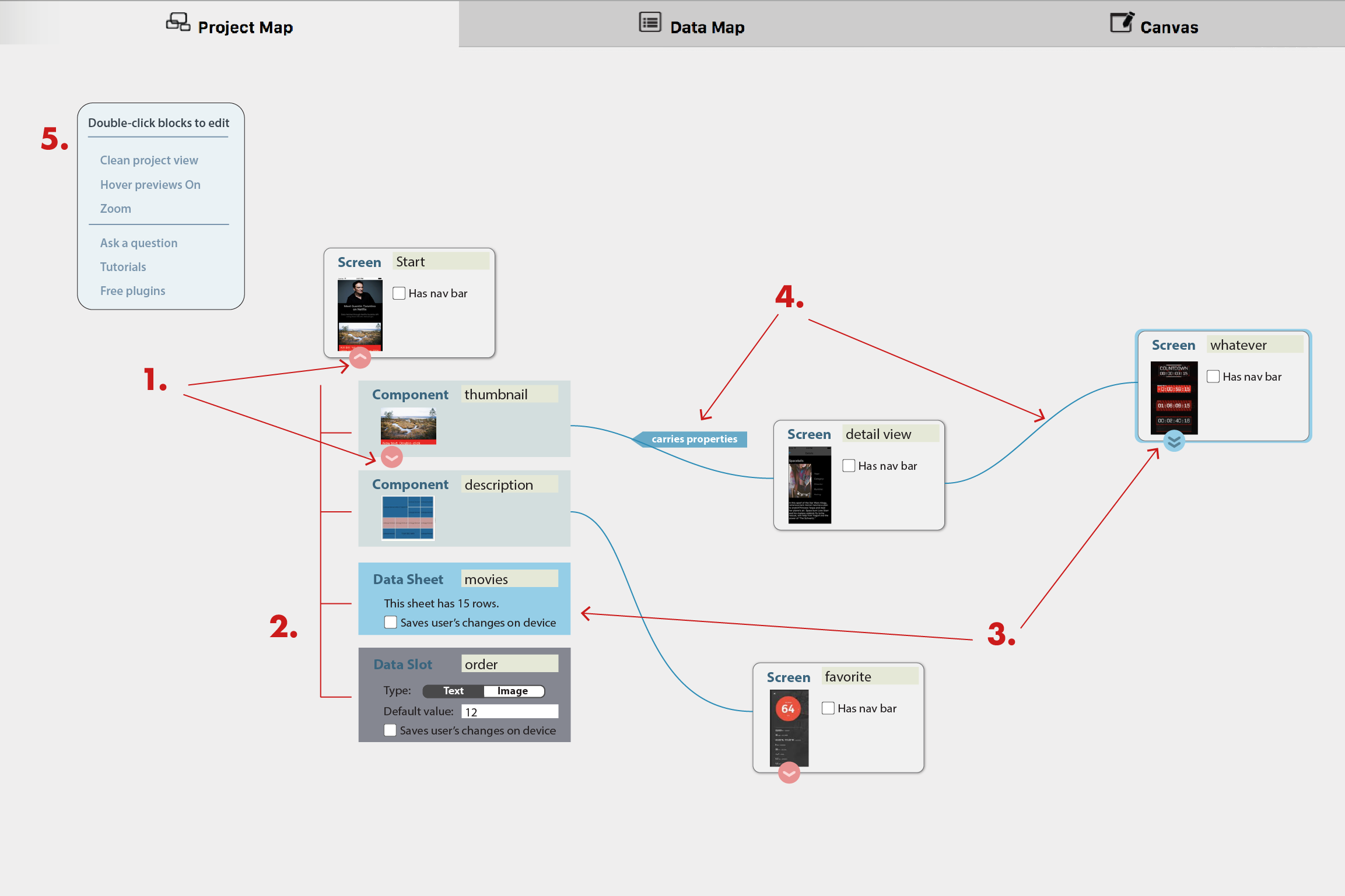
Several features to make a project map more readable:
- foldable blocks to hide/reveal children blocks (component/stencil/data)
If a screen/component is made from other components, or take value from data sheet/slot, an arrow icon appears at the bottom of the block. Toggle the arrow button can reveal or hide the child blocks. - tree-like grouping to show what a block contains (previously shown in dashed lines)
There is no longer the freedom to move around the components that are linked with a screen. The parent-child relationship is visualised in this indented tree structure. Dragging the parent in the project map results in moving the whole tree. - distributed representation of shared blocks
In some cases, a component/data sheet may be contained /used in multiple blocks. Instead of having one component/data block linking each related blocks with multiple lines, each of these blocks has the component/data in its tree. When one of the component/data (which is shared among blocks) is selected, all of its identical representations are highlighted as well. This also gives users an overview where the data is used in the project.
- lines for Go-to relationship
Lastly, the lines are reserved for representing Go-to type relationship.
You may have noticed that the text “double click to edit” and “drag from here to insert on canvas” on the blocks are gone. I think “double click to edit” is quite redundant to have it appear on each block. Once people have learned this trick (and most likely very quick), the text is nothing but noise. An explicit on-boarding should be sufficient, as well as a line somewhere in the project map, e.g., in the function bubble (5). “Clean,” “Hover previews,” and “Zoom” are also collected into the function bubble.
As for “drag from here to insert tcomponent on canvas”, this feature is no longer avaialbe in this horizontal-tab design. A more reasonable solution is to have the components (created in this project or from other libraries) appear in the Element List when in Canvas view so that users can directly drag from the list, instead of dragging it across from project map view to canvas view.